
6.8K

When an airline changes its livery and corporate branding, it usually causes mixed views from among the aviation enthusiast community and loyal customers.
It seems that over time we get used to new liveries and often forget what they used to look like. But sometimes it’s hard to forget.
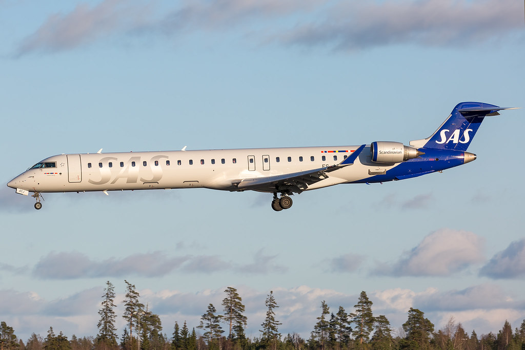
This time we look at SAS Scandinavian Airlines, which unveiled a new livery in 2019 with the delivery of its first Airbus A320neo and A350 aircraft.
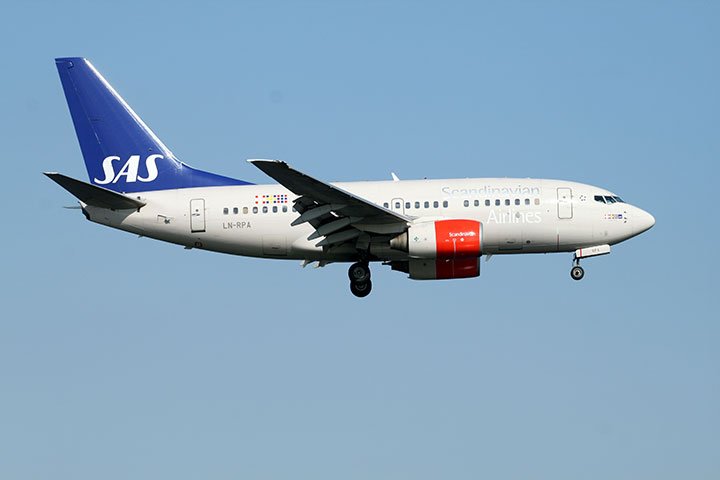
Gone were the sand-coloured fuselage and red engines, replaced by a silver and blue scheme.
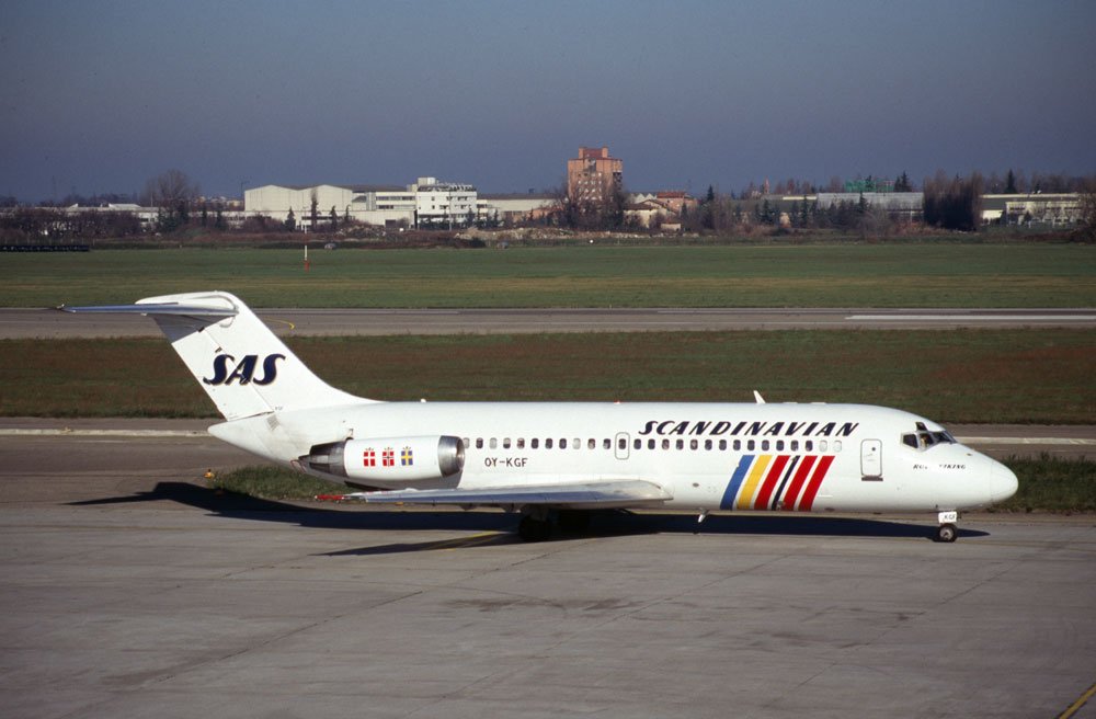
Perhaps you prefer the 1980s white livery with the Scandinavian flags? Leave a comment below and let us know which you prefer!
Author


18 comments
The 1980’s by a mile and even it is not the greatest livery for a major carrier. SAS has managed to take a rather normal image and make it progressively worse with each new non livery they use!
The new scheme looks fresh and bright but I much prefer most airline liveries from the 60’s when they had a cheatline.
I don’t much like planes that appear to be 90% white.
Love your website, its a godsend in these days of isolation and not being able to get out and see aircraft.
Thanks Terry!
Hi Matt – of the ones you’ve shown I prefer the 80’s white livery, but my all time favourite is the Viking livery that adorned the travelled back in the 60’s and 70’s.
Hi Matt- I agree with Jon, the 60’s scheme is much better!
I like the 80’s scheme.
Hello Matt – I agree with the two other correspondents (Terry, Jon, Ian). The 1960s Viking livery was the best by a long way. Could you post a picture of that for people not familiar with it to look at?
PS – Your newsletter is great. I always read it.
That should read ‘the three other correspondents’!!
I am afraid to say that I just do NOT approve of some of these NEW liveries especially of European Carriers,I didn’t rate Lufthansa’s new one launched a couple of years ago now? because it seems that everyone of them is taking the” All-White” route and had LH kept the Yellow Sun with the Crane in I think that it would have passed the test,SAS appears to have done the same thing by NOT retaining the Scandinavian countries flags like they have on the earlier scheme.
The same thing can be said about some of the Asian Airlines like Japan Airlines and Air New Zealand who’s I thought were a bit beyond the boundries and I agree with Terry that the liveries do look better with a cheatline though airlines who in the 1990s like Qantas,Philippine Airlines and Garuda Indonesia I thought looked fine WITHOUT cheatlines.
The new colour scheme is probably one of those that needs a nice sunny day , to have any chance of getting a decent photo, and whats the chance of that, living in europe, with the skys we get!!!!
Hi Matt, hi everybody and best …wishes. The 60’s scheme was original and captivating. Almost zero in terms of fantasy the next ones. The present new livery seems to me to be more sophisticated
The Viking longboat livery of the 50’s thou the 70’s was always one of my all-time favourite liveries and certainly the most iconic of the SAS liveries. It wasn’t, exactly a cheatline but colourful and a far remove from today,s bland schemes.
As a lover of modern, elegant and simple liveries, the new one appears amazing to me, though it need the sun to shine in its entire beauty. However, the old livery (blue tail/red engines) looks better on their crj fleet.
Hi Matt. I prefer the 80s white livery as that’s the one I remember with most fondness from when I started spotting in the early 80s. The last livery SAS had did grow on me after a time and the new one might too, but like some of the others who’ve commented, I much prefer older/retro liveries, with cheatlines and a lot of colour!
Thanks for all you do for us enthusiasts
Hi Matt. I think the current livery is an improvement on the previous two although the white fuselage/blue tail combo is hardly original. It should look good with sun shining on it. I agree the viking scheme of the 60s/70s is the best though. Can you pelase post a pic? Perhaps cheatlines will make a comback one day – fingers crossed!
Whilst I prefer the latest SAS livery to the previous one, it looks much like all the other new schemes out there at the moment. Also, I do wish that SAS had moved away from the unreadable silver titling; silver can look nice in a colour scheme, but not for the titling.
Whilst I imagine that many people’s favourite SAS scheme will be the blue and white ‘Viking longship’ scheme, my personal favourite is the white 70s scheme with the colours of the national flags near the front. Although technically a ‘Eurowhite’ scheme, it looked very classy at the time and I think it would still be modern today.
Matt, yes the older livery 1960-1980 no doubt at all
The current one, and the new LH one, is really awful…..
I have to say I absolutely hate the way the Japanese and Korean carriers decorate their aircraft with cartoons and all other balderdash.
I t just cheapens it. Best scheme ever…the 1970s BOAC scheme.
All quiet here in AUS too.
I’m just glad they retained the singular ‘SAS’ font, which has been one constant since the 60’s. As for my favorite, the 70s/80s all white, with the flag symbols near the front.