
When an airline changes its livery and corporate branding, it usually causes mixed views from among the aviation enthusiast community and loyal customers.
It seems that over time we get used to new liveries and often forget what they used to look like. But sometimes it’s hard to forget.
In this example, we look at Iberia, which first revealed its new livery a couple of years ago, replacing the traditional scheme worn since the 1980s. It gave the airline bolder use of the red and yellow colours, and got rid of the swooping cheatline above the windows and ‘B’ crown logo on the tail.
You can see the new livery above, and the one it replaced below.
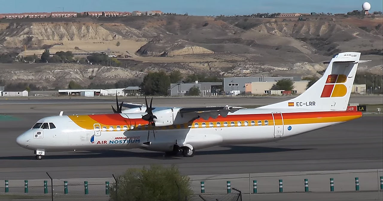
Photo (c) Erik Ritterbach
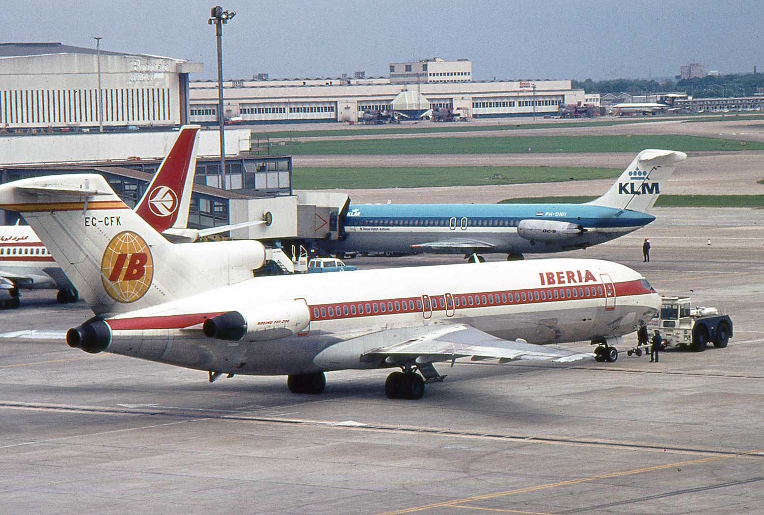
Or maybe you prefer the older 1960s and 70s livery worn by Iberia?
Which do you prefer? Leave a comment below.
Author


2 comments
I do very much like the new Iberia livery.
The airbus A350 shows it off very well.
I have just completed a model of the above too.
I do like the new livery more than I did when it was first introduced. For me I much preferred the previous livery introduced in the 80s and loved seeing their 727s, DC9s, DC10s and A300s and latterly the more modern types in those colours.