
When an airline changes its livery and corporate branding, it usually causes mixed views from among the aviation enthusiast community and loyal customers.
It seems that over time we get used to new liveries and often forget what they used to look like. But sometimes it’s hard to forget.
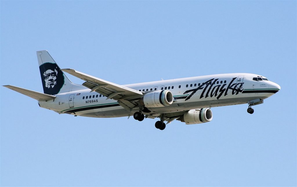
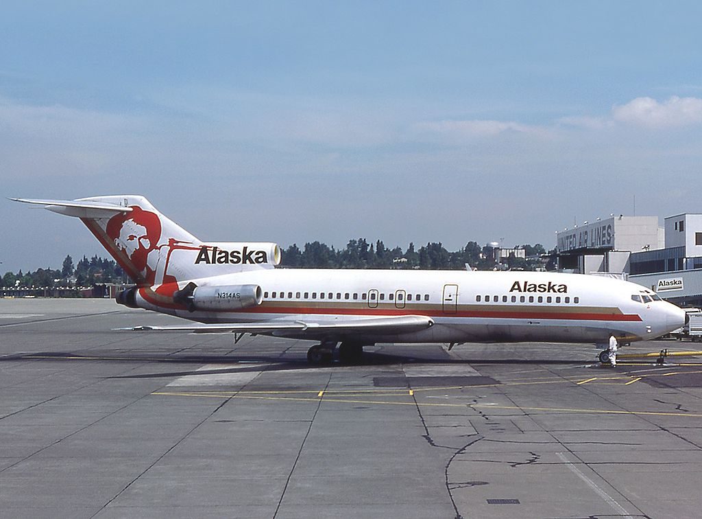
In this example, we look at Alaska Airlines, which first revealed its new livery a couple of years ago, replacing the previous scheme worn since the 1980s.
While it still incorporates the famous Eskimo tail motif so beloved of the airline, the new scheme adds bolder blues and greens where plainer cheatlines were before.
Michel Gilliand [GFDL 1.2 (http://www.gnu.org/licenses/old-licenses/fdl-1.2.html) or GFDL 1.2 (http://www.gnu.org/licenses/old-licenses/fdl-1.2.html)]

Or even this one?
Which do you prefer? Leave a comment below.
[Alaska Airlines and their Special Livery Aircraft]
Author


4 comments
The classic look is my favorite. The Boeing 727 “Seahawk One” was my favorite. It was the official charter aircraft for the Seattle Seahawks football team.
Years ago Alaska proposed doing away with the Eskimo on the tail. Once the public found out they were outraged. Whatever Alaska Airlines does, the Eskimo stays!!
I flew on Seahawk One twice while it was not busy with the team. It was a fabulous plane for passengers as the seats were larger to accommodate large football players.
I really liked the Golden Nuggets, But they were always filthy. My second choice is the last scheme on the 727-200. I really do like the current scheme on the 737’s